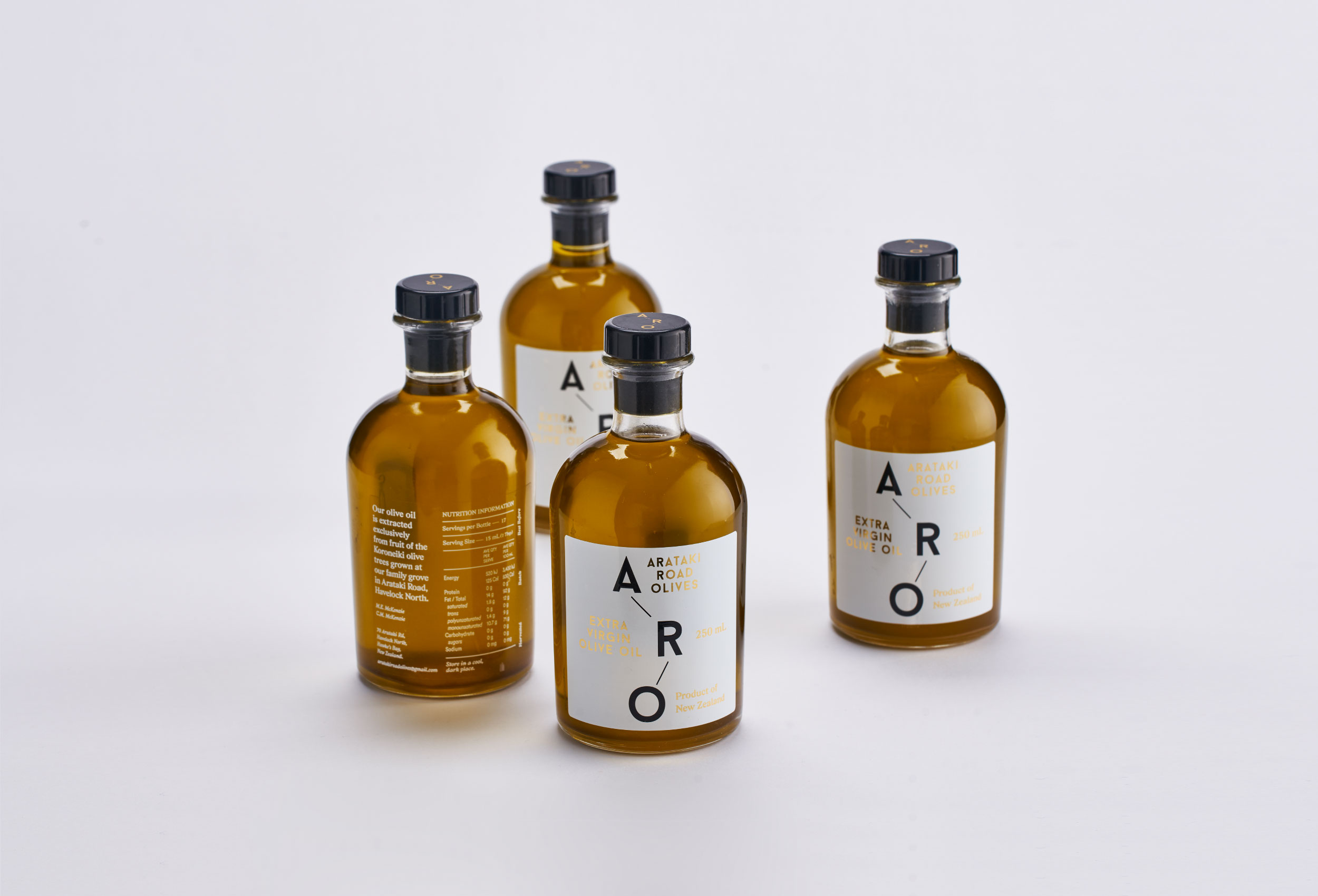
Arataki Olives
Brand & label
ARO is a small olivery in Hawke’s Bay. The trees were planted nine or ten years ago on land that had been in the family for a generation or two.
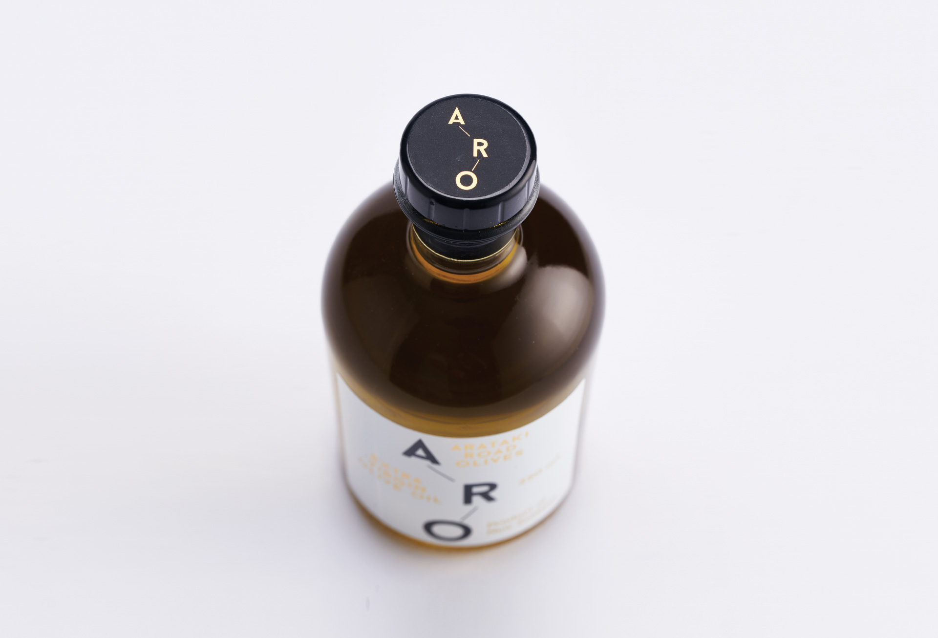
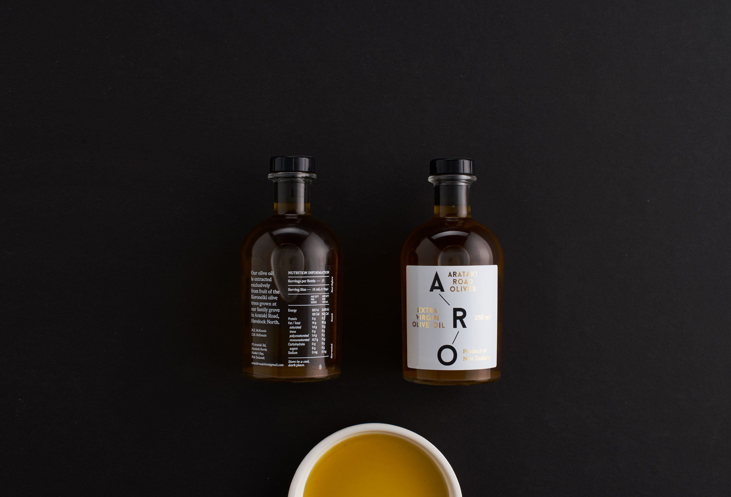
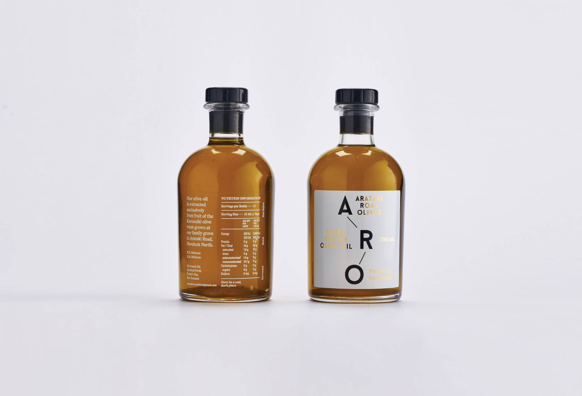
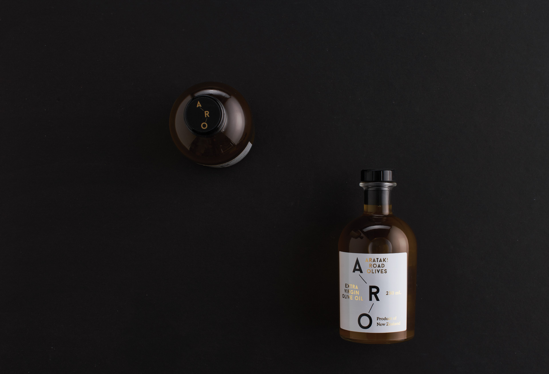
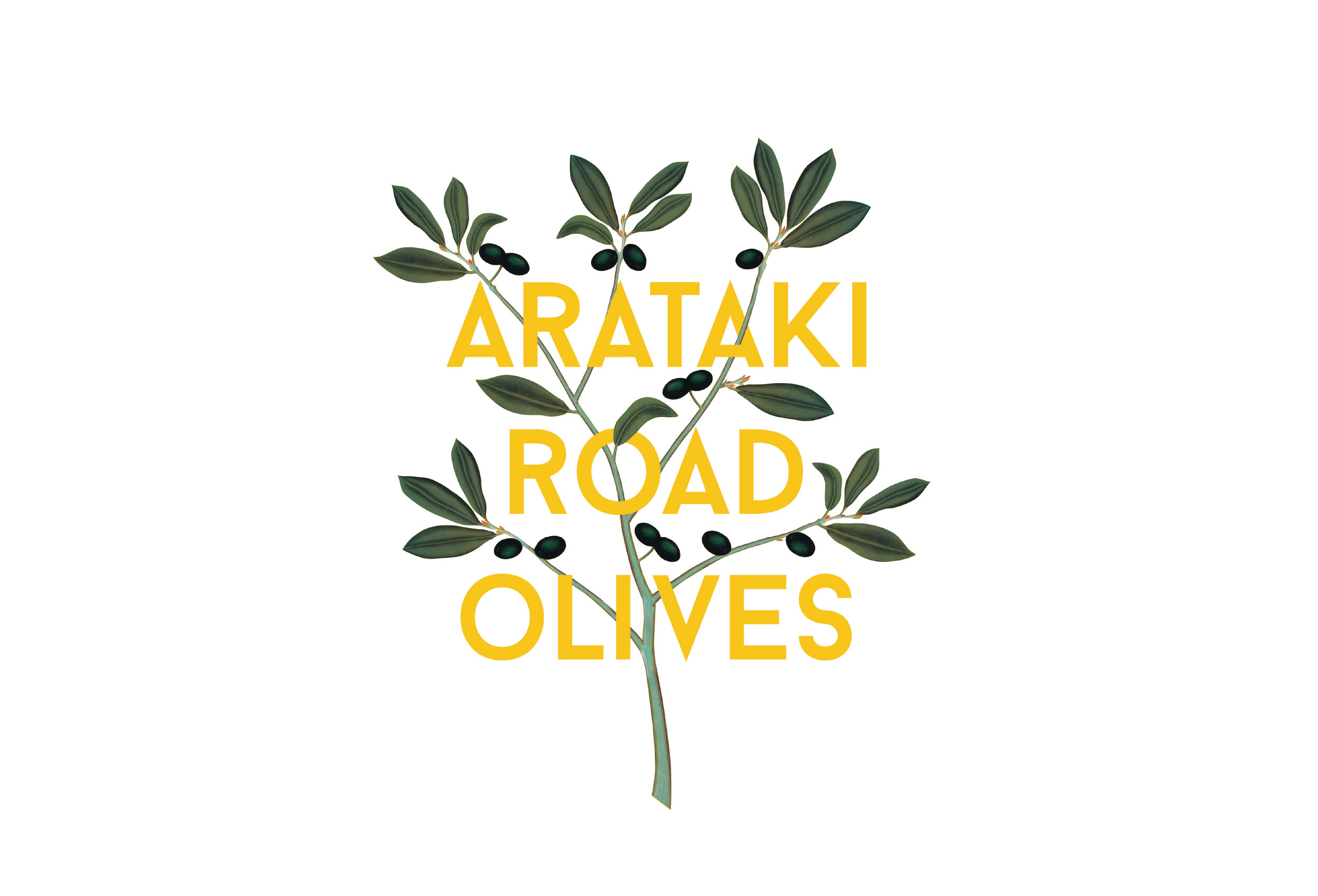
With the brand concept we felt it needed to reflect the old and the new that were at the heart of this project.
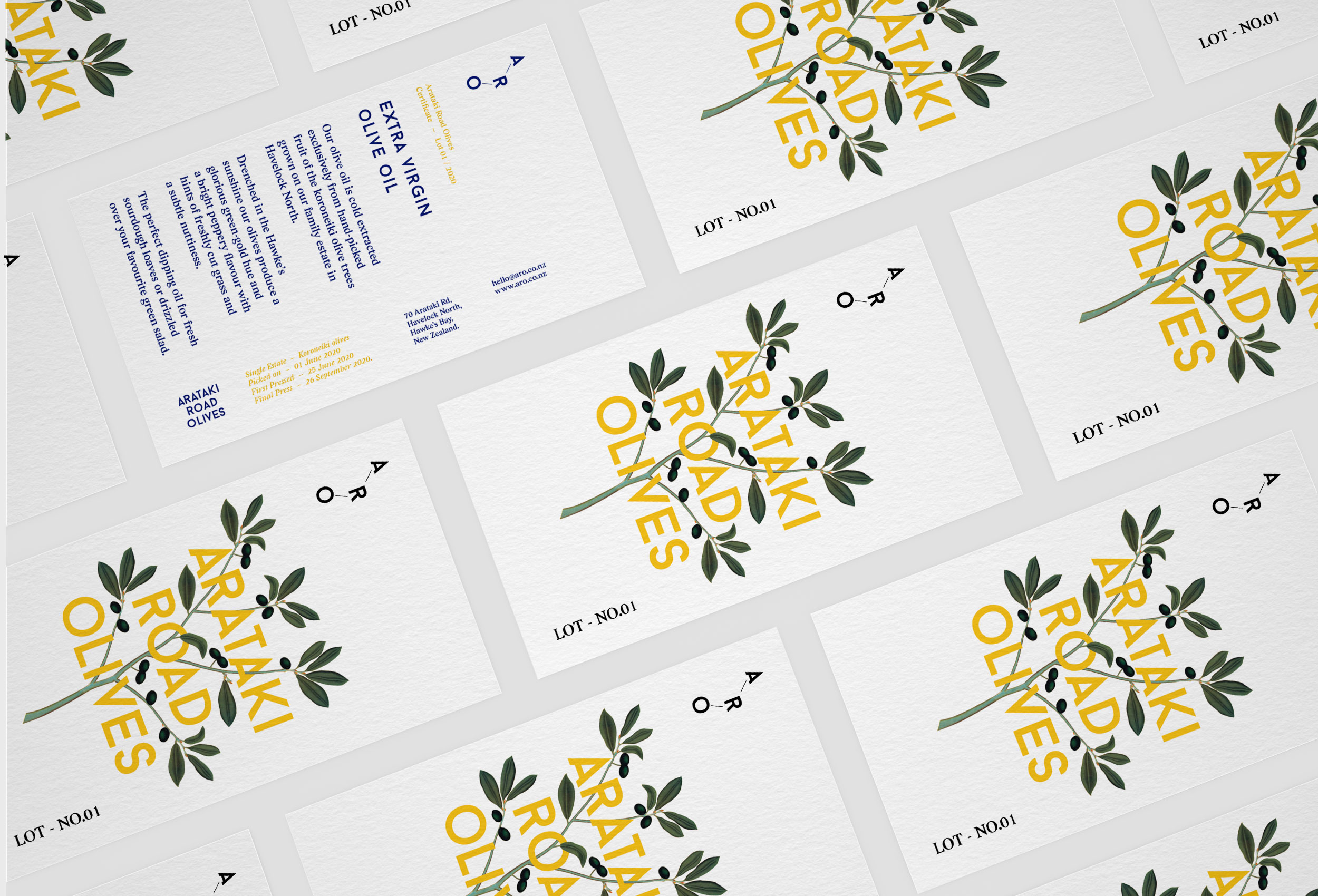
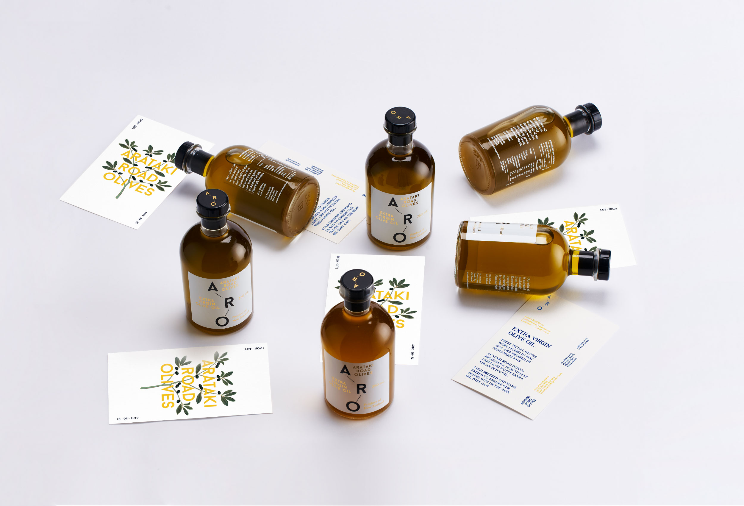
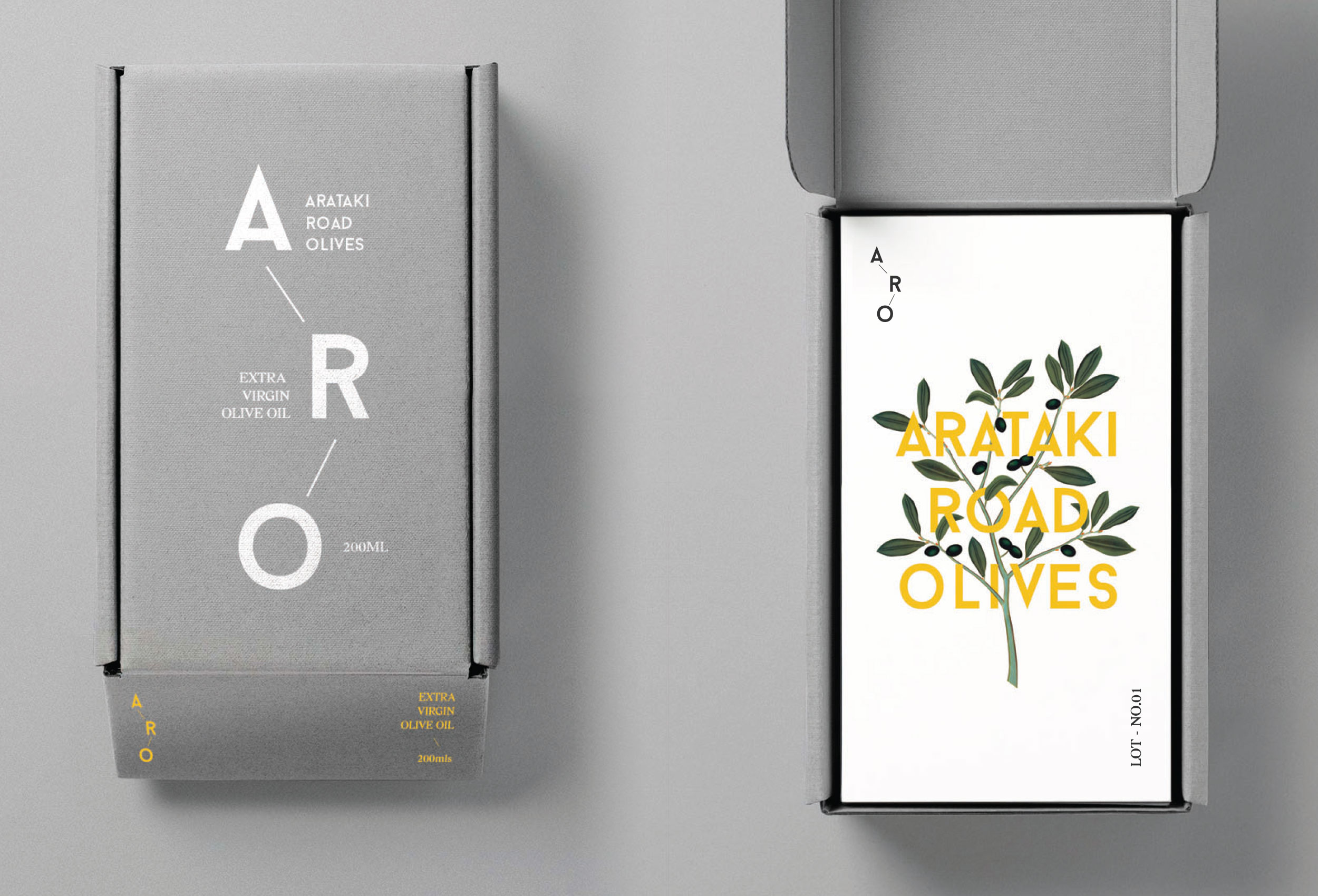
We used a modern graphic typeface and weaved it into a more traditional illustration of an olive branch. This gave us the option to use both elements together or separately across the brand and any associated brand material.
