Beach House Wines
Top Tier
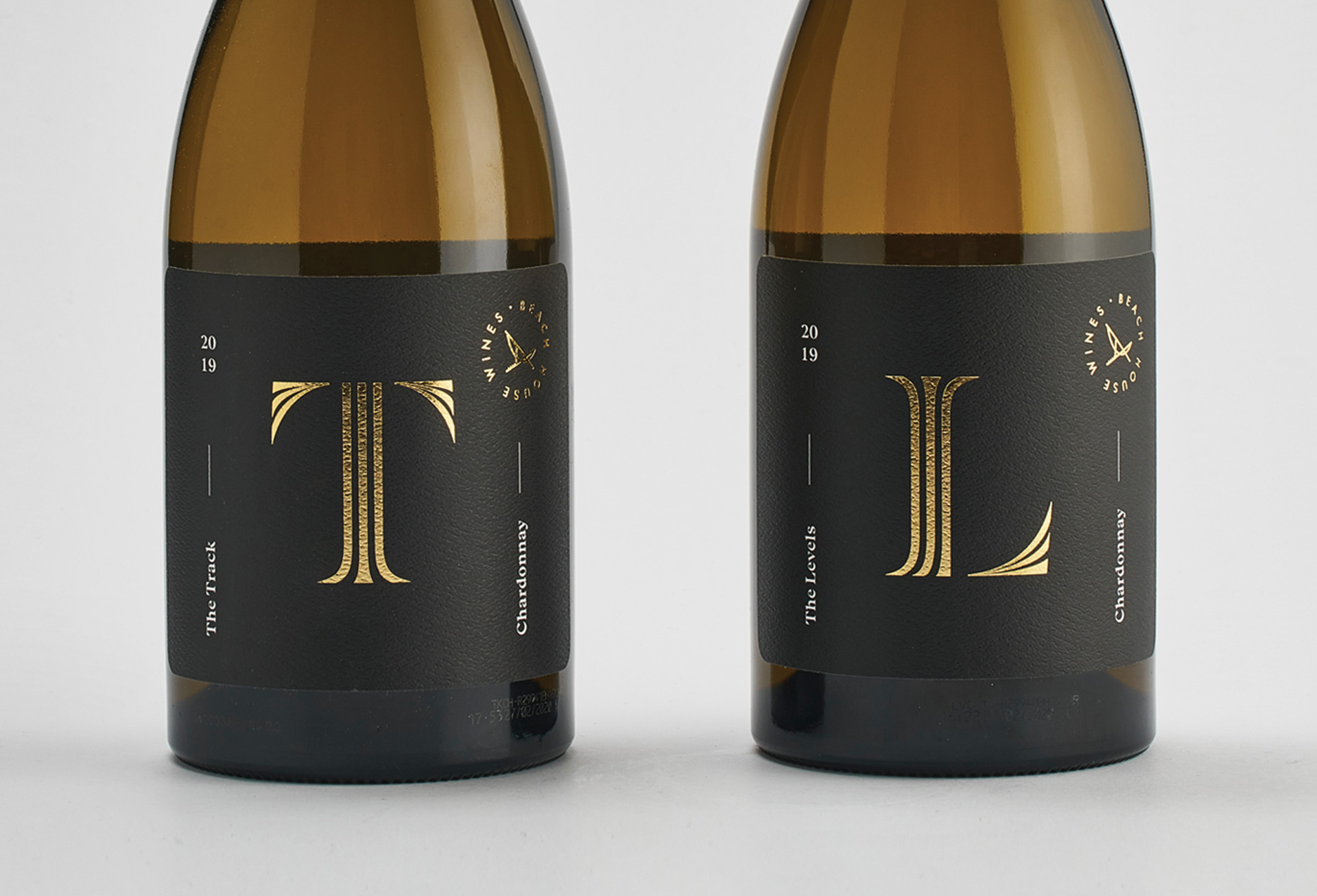
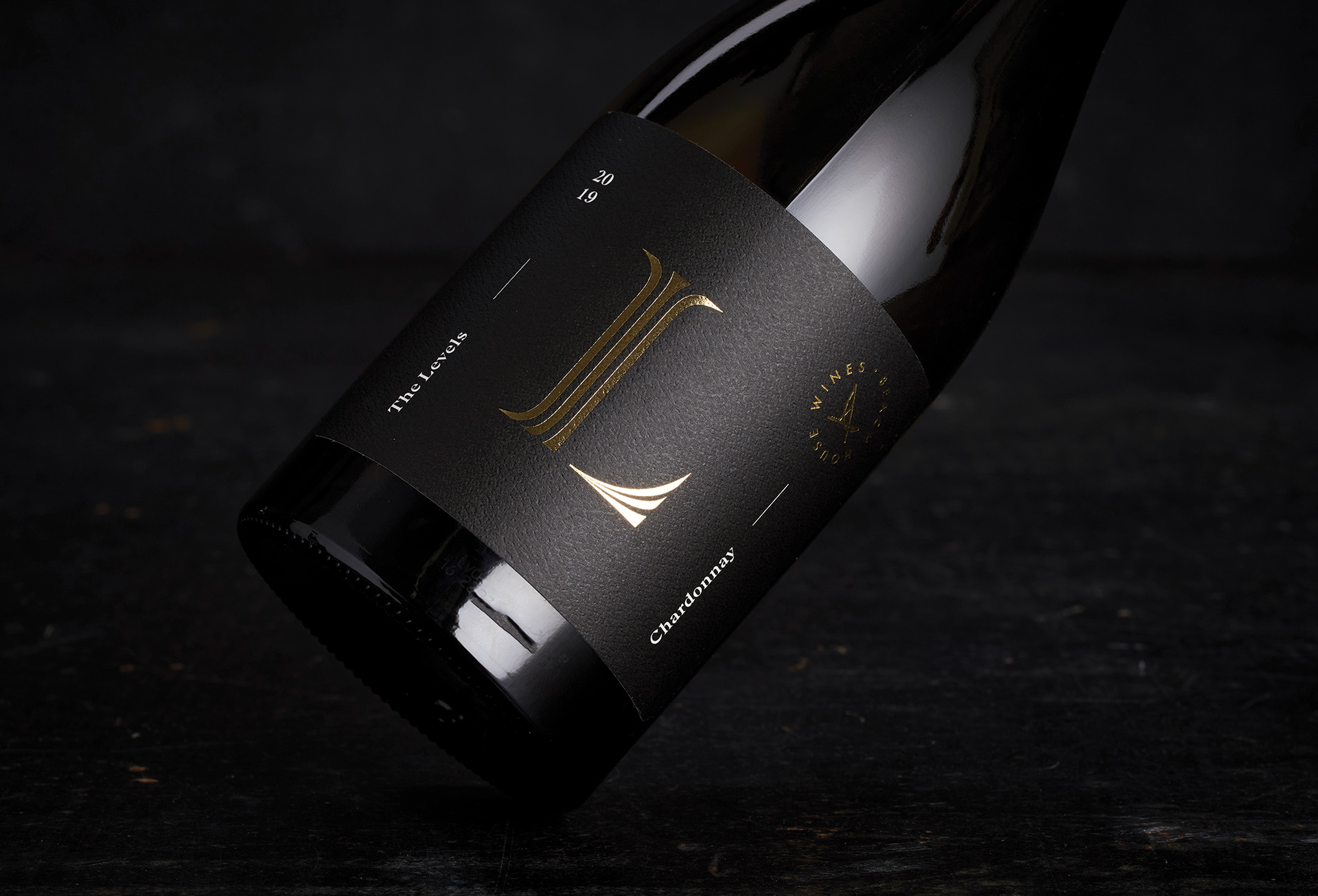
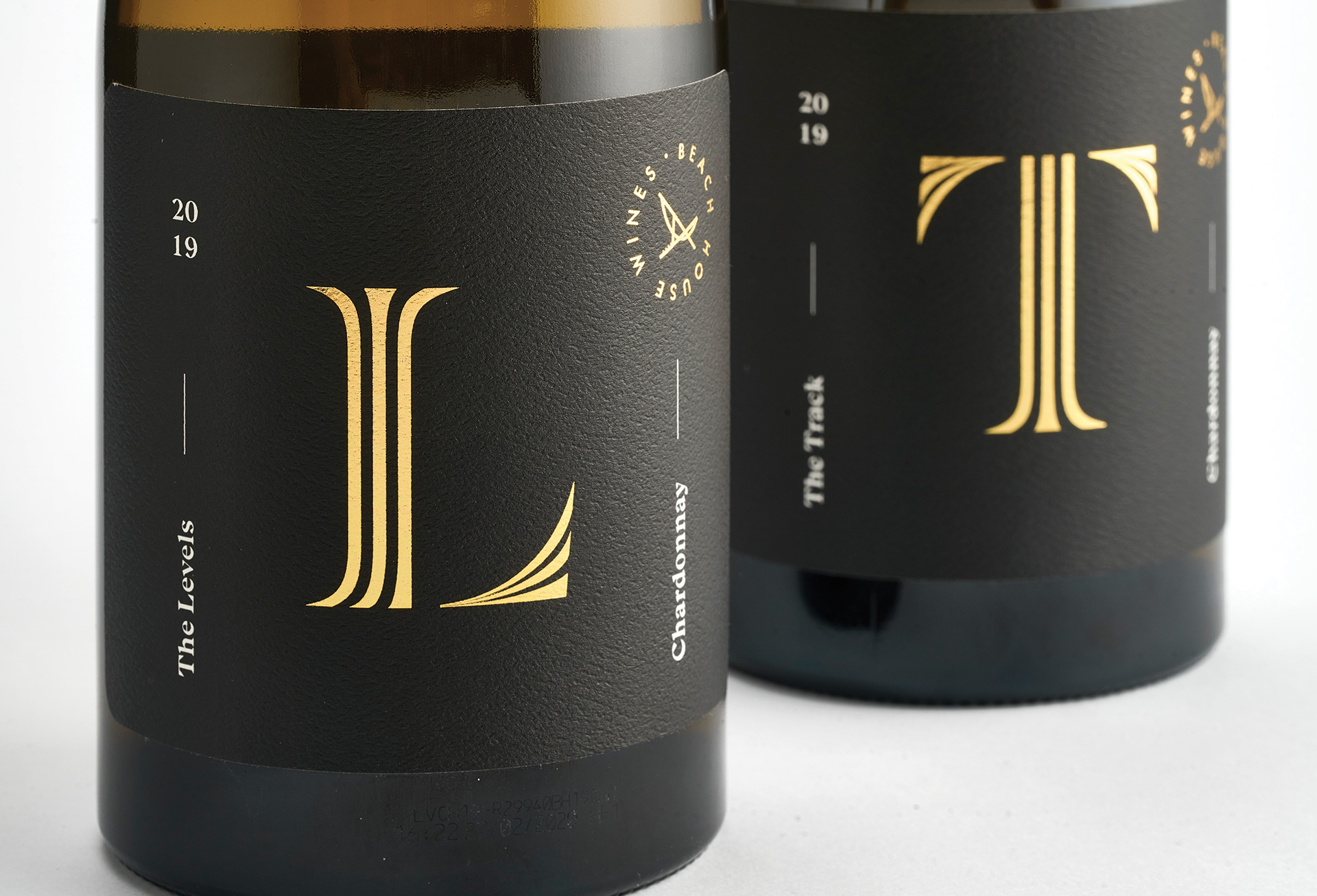
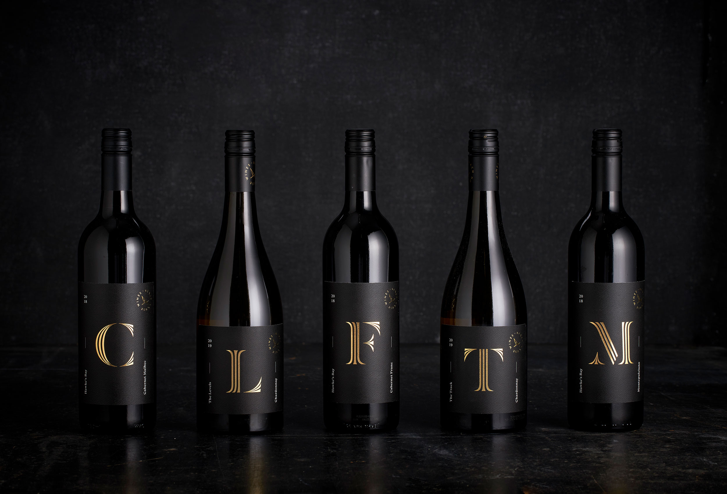
The sophisticated older sibling, to their younger sister Rose. We applied our simple language across his range of premium wines, employing a degree of formality and elegance suited to the higher price point and slightly more traditional buyer.
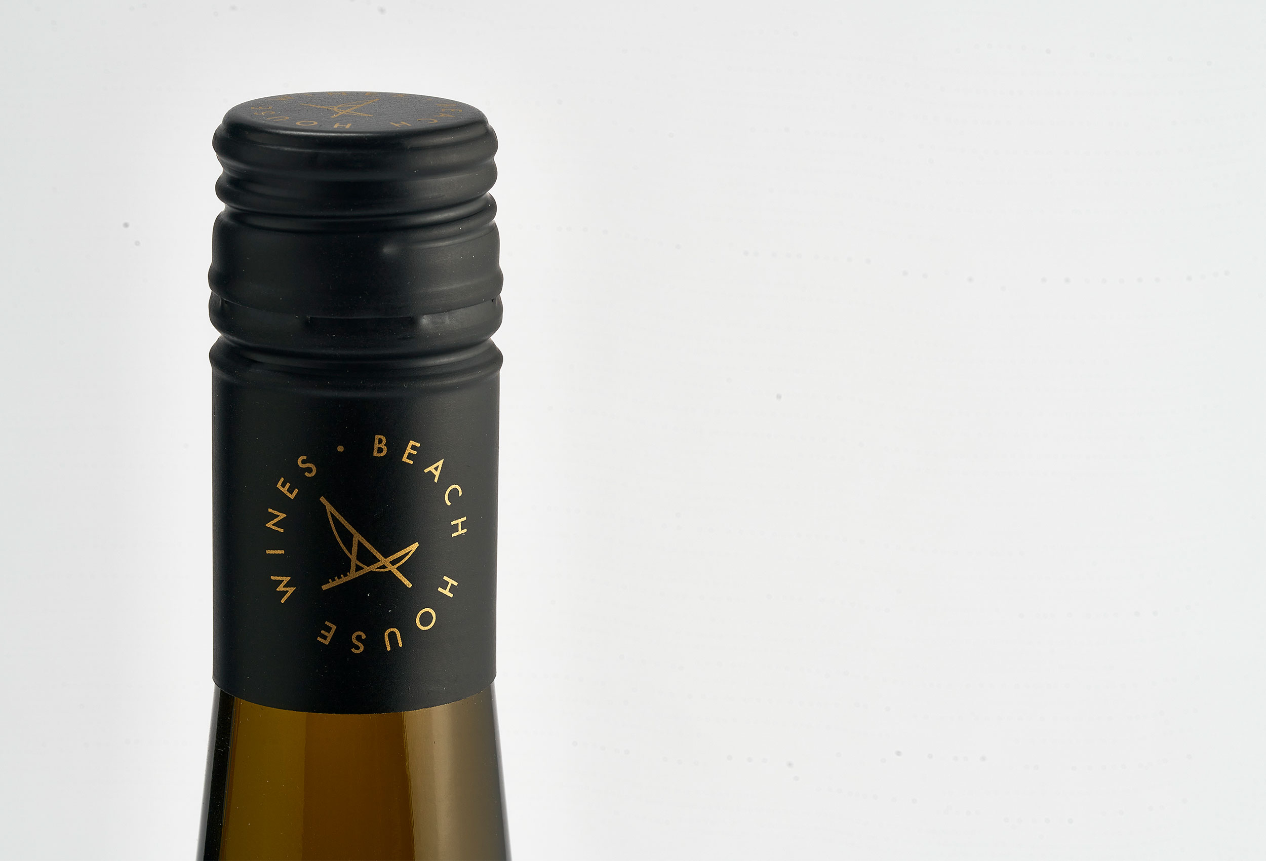
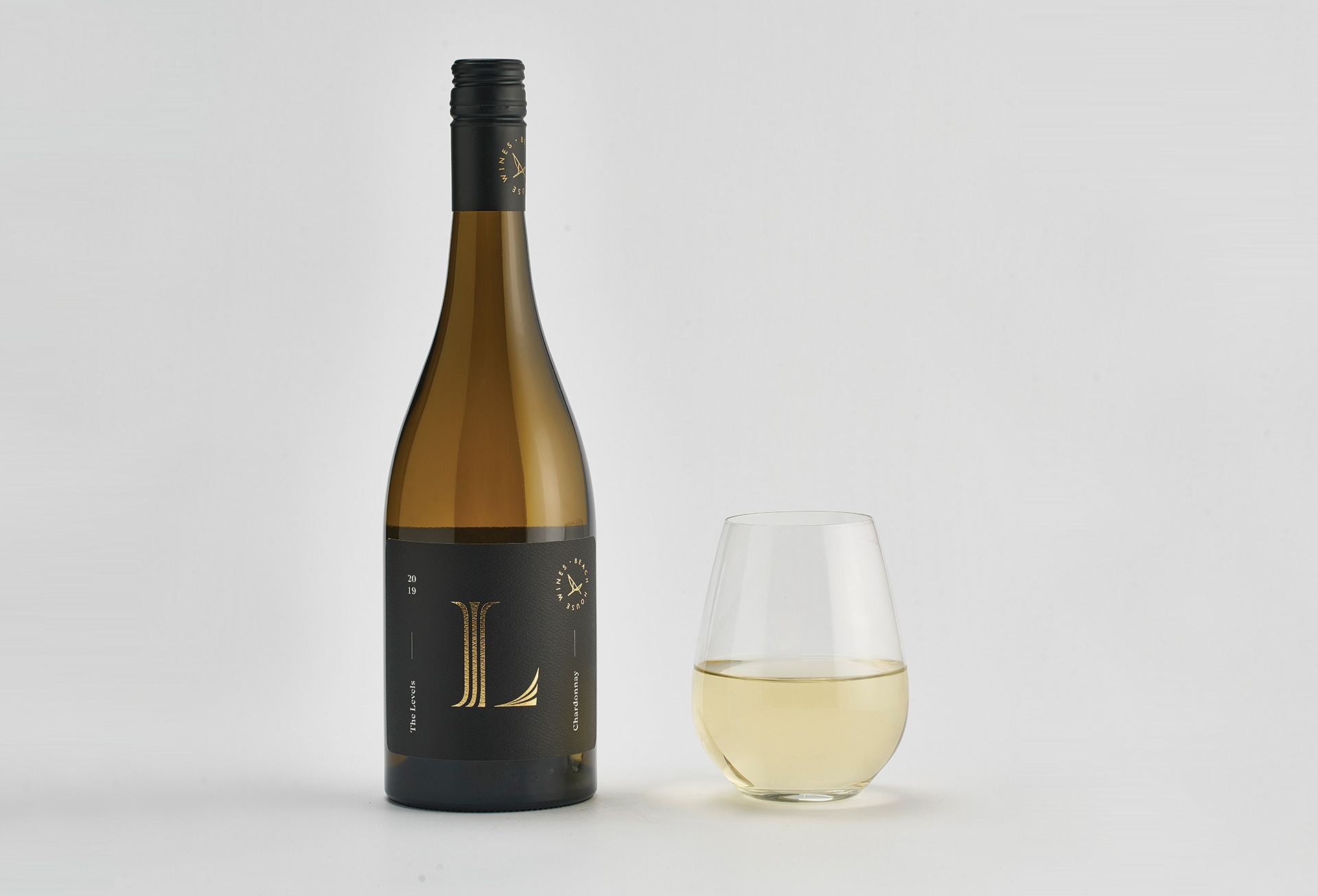
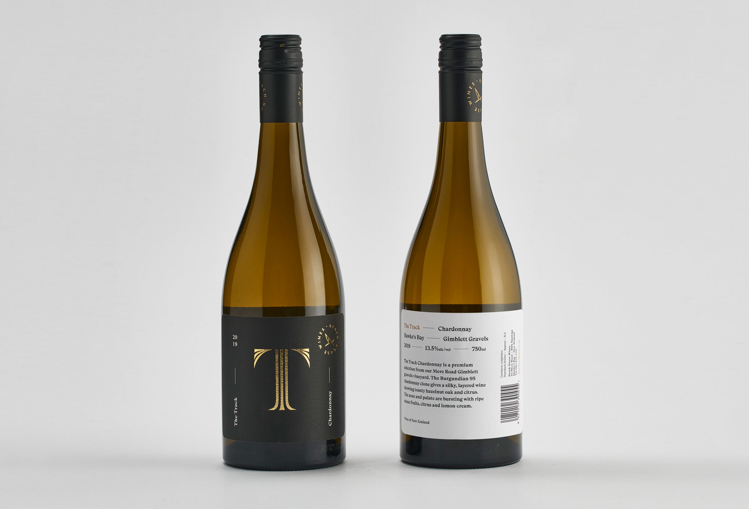
A classic serif initial in gold foil creates an immediate point of focus, with smaller, descriptive elements and brand crest occupying the label’s ‘corners’ helping to create a powerful sense of clarity and distinction. Although less playful in nature, these labels are immediately connected, like to be enjoyed and appreciated for
years to come.
